Using the slider map: click and drag the ‘slider’ arrows to toggle between the two maps by sliding ‘left’ or ‘right’
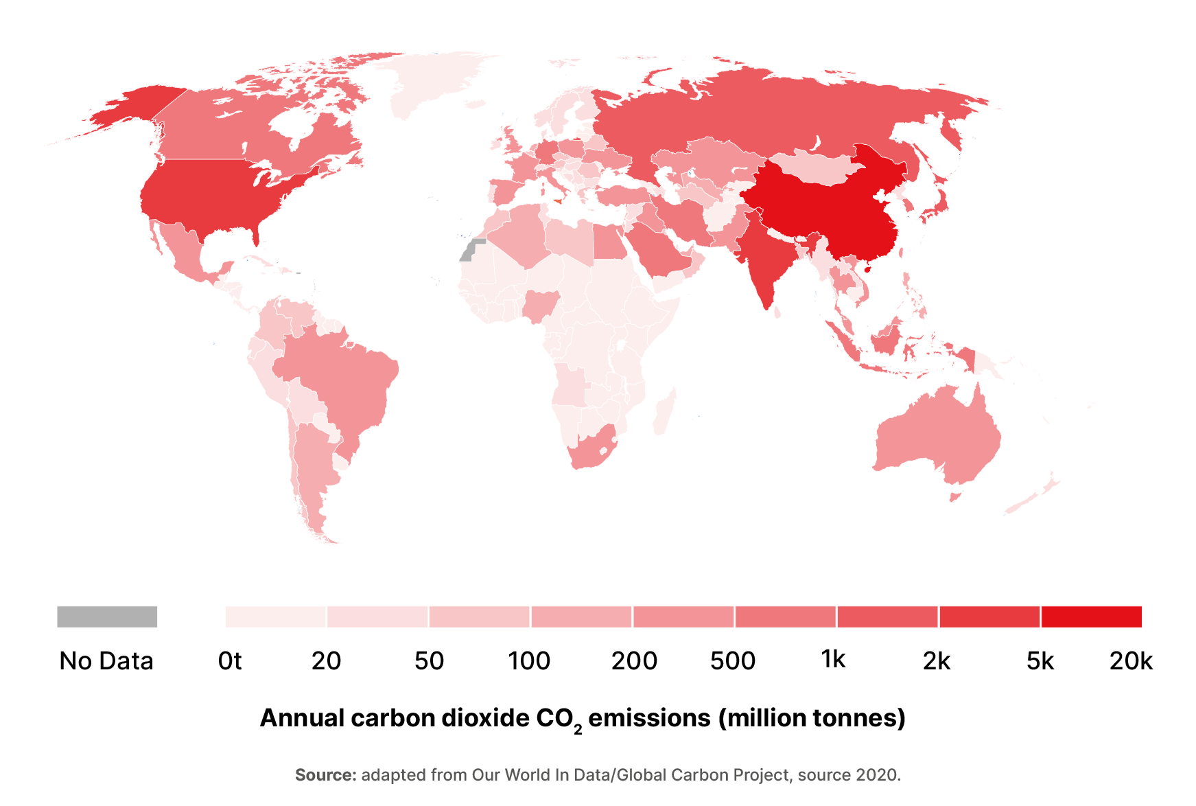
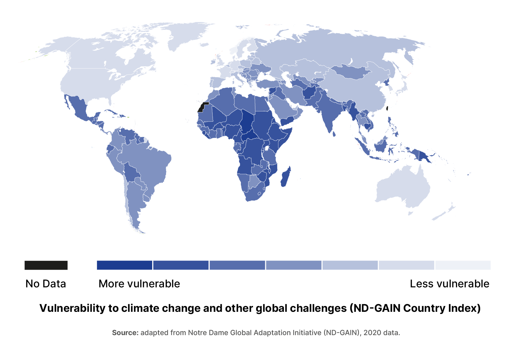
Are countries that emit the most carbon dioxide in the world also experiencing more vulnerability when it comes to climate change and extreme climate shock events such as floods, storms and drought?
A lot has been said and written about fossil fuels use and how we rely on them for heat, energy, transport and in the production of goods such as clothes, phones and plastics. As the Earth Overshoot Day team at the Global Footprint Network have noted, when it comes to food, fossil fuels are found everywhere along the supply chain:
“The fossil fuels required to grow, harvest, process, and distribute food makes up a significant part of the food Footprint. Although it wasn’t always the case, today we are firmly in the age of fossil fuel.” – Earth Overshoot Day, the Global Footprint Network
Another example: when it comes to energy use around 84% of the world’s energy consumption needs are met from fossil fuels, with oil accounting for 33% of the consumption in 2019 and natural gas at 24% and coal accounting for 27%, according to the Statistical Review of World Energy 2020 by energy company BP.
This ‘slider map’ invites readers to explore relationships in our food system and what can drive or deny access to healthy nutritious food based on the activities, roles and impact of countries in the world today.
In this case, the What does mapping fossil fuel use and climate vulnerability look like? map explores the relationship between fossil fuel use by country and countries that are vulnerable to the impact of climate change.
Key term – Climate Vulnerability: ND-GAIN defines climate vulnerability as a measure of a country’s exposure, sensitivity and ability to adapt to the negative impact of climate change. It measures the overall vulnerability by considering vulnerability in six life-supporting sectors – food, water, health, ecosystem service, human habitat and infrastructure.
Explore the data used in these maps:
- Global Carbon Budget 2020 by Global Carbon Project via Our World in Data
- Multidimensional climate vulnerability based on ND-GAIN Index score 2022 by the Notre Dame Global Adaptation Initiative (ND-GAIN)
Suggested learning tasks
A number of learning tasks are suggested with ideas for integration as part of English, Art, Geography, Mathematics, Home Economics:
- Explore the visuals presented by scrolling between the two maps and the information they present. What do you think of the two stories that the data presents?
- Why are there different colours on the map?
- Look at the data sources and find something interesting. Draw a graph, table or pie chart of what you’ve found and prepare 1 sentence on why this is interesting to you.
- What are the differences between the maps? Prepare a short response to the two maps and what it tells us about geography and who is responsible.
- In small groups prepare a short visual presentation (using websites, statistics, images etc.) on the topic of inequality – what does inequality mean? How might it impact on people and places in this slider map in terms of accessing healthy nutritious food?
Explore the next two maps in the series on key drivers of global hunger:
- Map 2: how are food security and company profits connected?
- Map 3: How does armed conflict and the arms industry drive hunger?
For more:
- Check out the videos playlist featuring 16 videos on how we can end world hunger & feed the future.
- Take a look at the World Food Day page on Scoilnet for SPHE-related materials
- Is there enough food to feed everyone in the world? Try your luck at the World Food Day interactive quiz!
- An additional 345 million people are food insecure. How did this happen? Is access to food or lack of food the key issue? Navika Mehta reviews the latest flagship report on global food security.
This post is brought to you as part of the World Food Day 2022 series – an editorial partnership with Scoilnet, Concern Worldwide, Self Help Africa and developmenteducation.ie
More on developmenteducation.ie

Trends Report 2023
A round-up of activities, events and trend analytics from developmenteducation.ie in 2023
Are lithium batteries the magic wand for the world’s woes?
Elon Musk tweeted that ‘Lithium batteries are the new oil’ as an essential energy source of a cleaner, greener future. Is he right? A fact check by Kai Evans
Decolonise engineering
How do we remove the legacies of colonialism from engineering? Engineer Adedotun Adekeye explores this question in a new two-part series
Empathy – Who Cares Anyway?
Brighid Golden explores the concepts of sympathy, empathy and selective empathy and how to explore these in your teaching spaces.
A guide to exploring the SDGs through data
Not sure where to begin with data on the SDGS at local, regional, national or international? We have you covered. A short guide by Kai Evans
African migrants roast dog in Ireland? No, video of pig barbeque for Dublin homeless
A video showing an animal being roasted on a spit has brought vitriolic racist hate online, with commenters claiming it shows African migrants in Ireland roasting a dog. But the animal in the video is a pig. A fact check by Mary Alexander.

